
Cartography in official D&D products have undergone quite a change through the four decades of its publication. Most modern maps are quite different from those published in the early years. Some of that has to do with printing costs/technology, and some has to do with changing styles.
I see RPG maps as falling into two categories: adventures and campaign settings. Campaign setting maps have a different goal than those in adventures. Campaign setting maps need to convey a high-level overview of the setting, provide additional flavor, and provide just enough information for the DM/GM to run a game in that setting. This means that campaign setting maps should be able to be used for when PCs are engaging in overland travel across large areas, and show where major landmarks are located.
Adventure maps, on the other hand, are vital to providing tactical information for the DM/GM in order to run that particular adventure. The scale of the maps tends to be smaller, and a lot more detail is generally required. While campaign setting maps can be more abstract or “artistic” in presentation, adventure maps needs to have game usability as the first consideration. There generally isn’t much room for abstract or overly creative map design if it doesn’t directly help the DM/GM run the game.
The Early Years
When it comes to adventure modules, 1978 was a big year for TSR. In Search of the Unknown was included in the D&D Basic Set. The classic trilogy of D1: Descent into the Depth of the Earth, D2: Shrine of the Kuo-Toa, and D3: Vault of the Drow were released. Player characters got to fight giants in the trilogy of G1: Steading of the Hill Giant Chief, G2: Glacial Rift of the Frost Giant Jarl, and G3: Hall of the Fire King. And the infamous S1: Tomb of Horrors slaughtered countless characters.
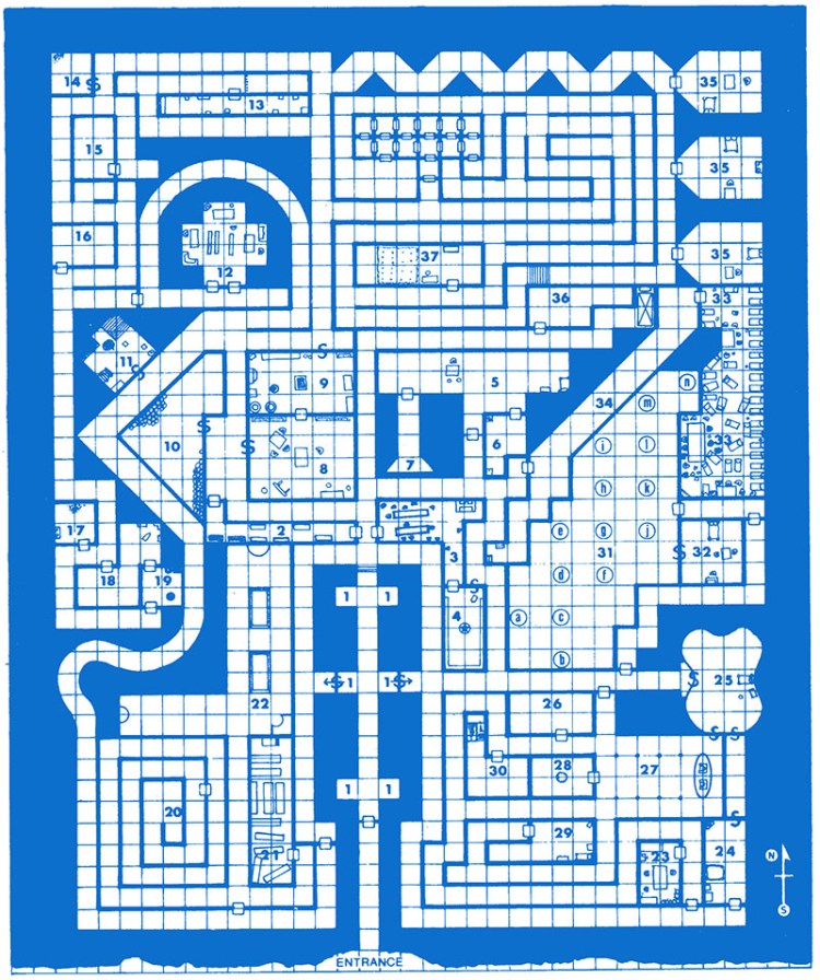
So let’s take a look at some of the maps in those early modules. The classic blue ink on white background maps should be familiar to all D&D players from the late 70’s and early 80’s.
Here is a very detailed map from In Search of the Unknown:
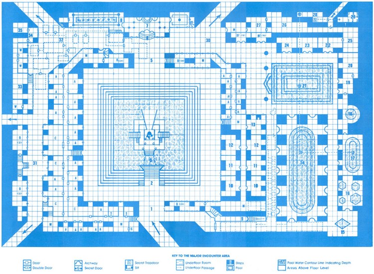
This is the main area map from Shrine of the Kuo-Toa:
And this is how the underground passages were mapped:

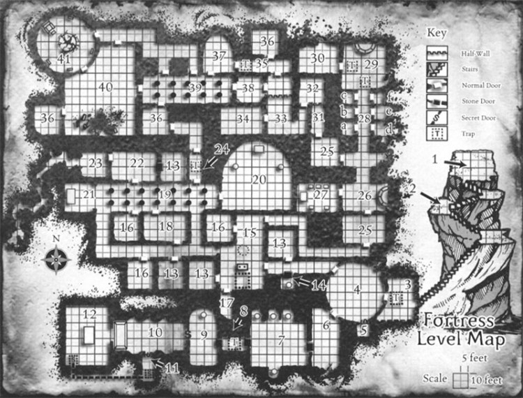
Here is the main complex in Glacial Rift of the Frost Giant Jarl (included to show how they did irregular cave areas:

The End of TSR
During the time of A&D 2E, TSR published a large number of campaign settings and many adventure modules. Some of these were great (Gates of Firestorm Peak) and many were absolutely terrible (Gargoyle, Greyhawk Ruins). So we’re jumping ahead by 15-20 years to look at a couple of changes in adventure maps.
One notable change was the switch from the large blue ink on white background maps that were printed on the inside of the (removable) covers. In the 2E era, many maps were in colour (either as separate maps or in a map book), or were greyscale maps inserted among the text of the adventure.
Here’s the separate map from Gates of Firestorm Peak, circa 1996:

This is from the map book in Return to the Tomb of Horrors:

And here’s an example of a map placed among the adventure module text, from Die, Vecna, Die!, the very last module published by TSR:
Wizards of the Coast
Adventured published for the third edition of D&D used both black and white maps and full-color maps, depending on the adventure.
Here’s one of the first 3E maps, from the excellent The Sunless Citadel:
Here is a full-color map from the also excellent Red Hand of Doom:

Maps for fourth-edition adventures were almost always in color, and were placed in the relevant section for each combat encounter.
Here’s an example from H2: Thunderspire Labyrinth:
The Newest Maps
While the full-color maps that WotC introduced during the third edition era are quite pretty, and the maps in the fourth edition adventures look even better, WotC has really outdone themselves with the maps in the fifth edition adventures.
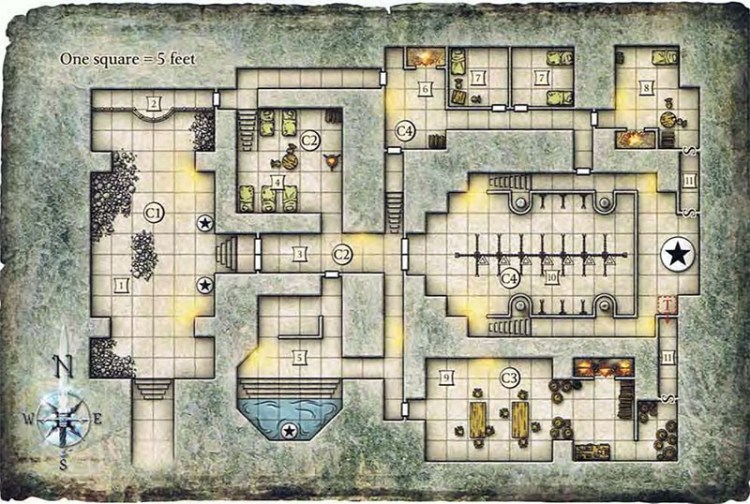
Here are a couple of maps from Tomb of Annihilation:
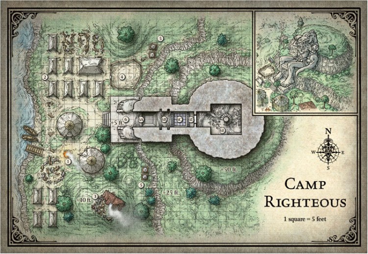
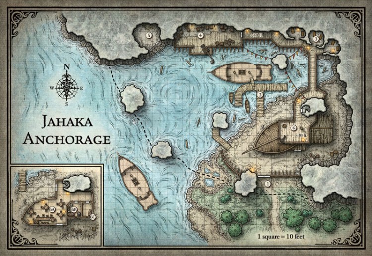
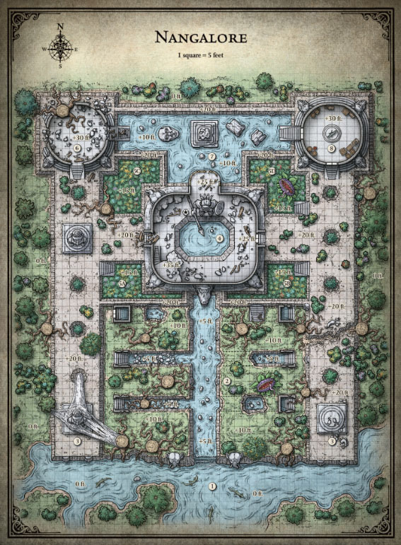
I think these maps are gorgeous. These maps are no longer just pieces of information, they are also pictures that add flavor to the adventure itself.
Furthermore, if you have purchased content on DnD Beyond, you have access to player’s versions of the maps we well. This means that the beautiful maps are seen not just by the DM. The players can also enjoy the great artwork.
What’s Your Preference?
I’ve focused on official D&D adventures in this post, but there are countless third-party publishers who produce adventures with maps. Some OSR publishers pay homage to the early blue-on-white maps by mirroring that look in their own books. Others play with adventure maps in all kinds of ways (certainly more than I have time to get into in this post).
Everyone has their own preference for how they want adventure maps to look. Some people prefer simple black-and-white line drawings, while others want the full-color painted artwork. Neither is “right” or “wrong”—there are pros and cons to each end of the spectrum, and it’s really about what works best for the individual DM.
Where does your preference sit on that spectrum? What published maps are your favorites (from any publisher or any game)? What examples can you give us of maps that are the epitome of “usable” from a gaming standpoint? Tell us about them in the comments.
