Key points
A bar chart is a type of graph used to represent a Data that is not numbers, eg, words. or Data that takes specific values, often whole numbers, eg, the number of siblings, shoe sizes. set of data. It uses different height rectangles, or bars, to represent the The number of times something occurs. of each category.
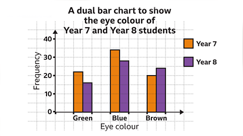
It can be used to make comparisons between the categories in a set of data.
The frequency is usually represented on the The line on a graph that runs vertically (up-down) from the origin.. The labelling on the The line on a graph that runs horizontally (left-right) from the origin. depends on what data the bar chart is representing.
A bar chart should have gaps between the bars.
Creating a bar chart
To create a bar chart data is required. The data often comes in the form of a table.
To create a bar chart:
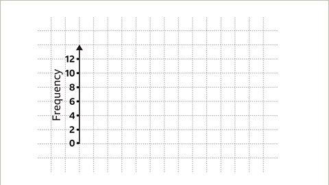
- Look for the largest frequency in your table.
- Draw a The line on a graph that runs vertically (up-down) from the origin. on your square paper or graph paper.
- Choose an appropriate scale for this axis and label your axis up to the largest frequency.
- Look at how many categories are needed for the horizontal axis.
- Draw and label the The line on a graph that runs horizontally (left-right) from the origin. , remembering to leave spaces for the gaps between the bars.
- Draw each bar the correct height, based on the frequencies.
- Check you have labelled each axis correctly and give your bar chart a title.
Examples
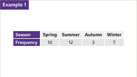
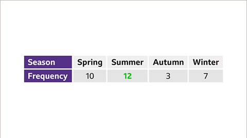
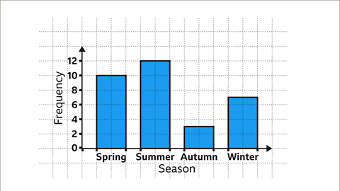
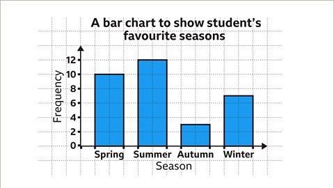
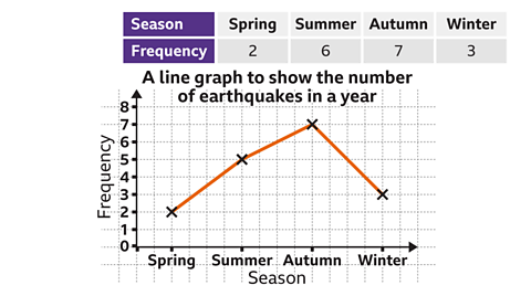
Image caption, 32 students were asked which season was their favourite. The table shows the results. Construct a bar chart that represents these results.


1 of 10
Questions
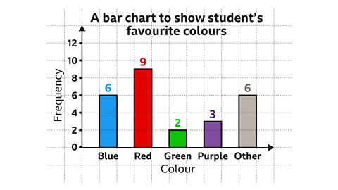
This bar chart shows student’s favourite colour.
How many students were asked what their favourite colour was?
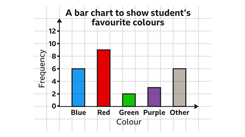
Number of students asked = 6 + 9 + 2 + 3 + 6 = 26
Twenty six students were asked their favourite colour.
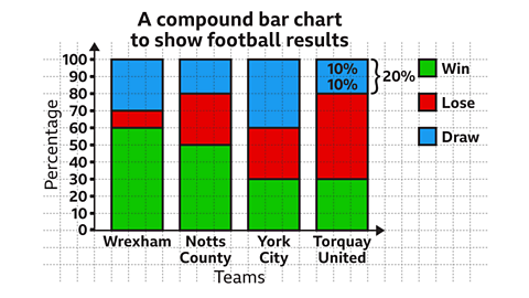
This compound bar chart shows the outcome of fixtures for four football teams for a season.
What percentage of games did Torquay United draw?
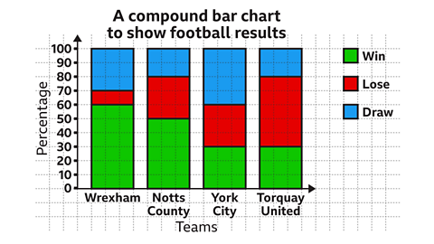
Each square in the bar represents 10%
The bar for draw, for Torquay United is two squares high.
This is equivalent to 20%
Practise working out bar charts
Practise working out bar charts with this quiz. You may need a pen and paper to help you with your answers.
Quiz
Real-life maths

A A scientist who studies both the Earth's natural environment and human society. may use climate graphs to study changes in weather patterns in regions of the world. One type of climate graph shows precipitation or rainfall. This takes the form of a bar chart with the rainfall for each month being represent as a bar. The height of the bar indicates the quantity of a rainfall during that month.
Game - Divided Islands
Divided Islands. game
Use your maths skills to help the islanders of Ichi build bridges and bring light back to the islands in this free game from BBC Bitesize.

More on Representing data
Find out more by working through a topic
- count2 of 6
- count3 of 6
- count4 of 6
- count5 of 6
