
which bar chart orientation should I use?
Through virtual and in-person workshops around the globe, we have taught tens of thousands of people how to communicate effectively with data. This series captures some of the noteworthy questions we hear during those sessions—and our answers.

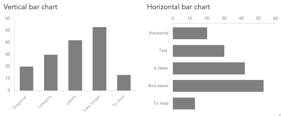
Your lesson on choosing an appropriate visual covers a variety of available bar charts. When should I use a horizontal bar chart, and when should I use a vertical bar chart?
When it comes to the horizontal vs. vertical decision, our founder Cole has an admitted penchant for horizontal bar graphs, for a couple of reasons:
Horizontal bars are easy to read, since the layout mimics how we process information, where we read from left to right, starting at the top (in western cultures).
A horizontal bar chart is a great option for long category names, because there is more space on the left-hand side of the chart for axis labels to be placed and horizontally oriented. A horizontal bar chart would be a better choice if the text on the x-axis of a vertical bar chart would have to be diagonal (or worse, cut off) to fit.
Conversely, a vertical bar chart can be a better choice if data is ordinal, meaning the categories have a natural sequence, and ordering them left to right is more logical. Examples of ordinal variables include:
age ranges
income brackets
other binned groupings of quantities (e.g., 1-10, 11-20, etc.)
horizontal position, like west to east timezones
Sometimes, the choice for using a horizontal or a vertical bar chart could simply come down to how well it fits in the available presentation space. For example, a chart with a lot of categories might work better as a vertical chart in a presentation slide (which is wider than it is tall), but as a horizontal chart in a printed report.
Another reason to consider one orientation over the other is that the story behind the data may be better served by one of the chart types. In this case, the chart could serve as a metaphorical or symbolic representation of the data. A vertical bar chart could represent filling something up because it resembles temperature rising in a thermometer, or liquid filling up a bucket. On the other hand, a horizontal bar chart could symbolize racing towards a goal.
Aligning the orientation to the data is more intuitive for the audience and there is some scientific evidence to support that it is also more effective. Avoid saying something is higher and then visually showing it lower because it causes extra effort for the audience to reconcile the mismatch between what they are seeing and what they are hearing (or reading).
A previous SWD challenge submission by Ligia uses both bar chart orientations, illustrating metaphorical representations of the data well.
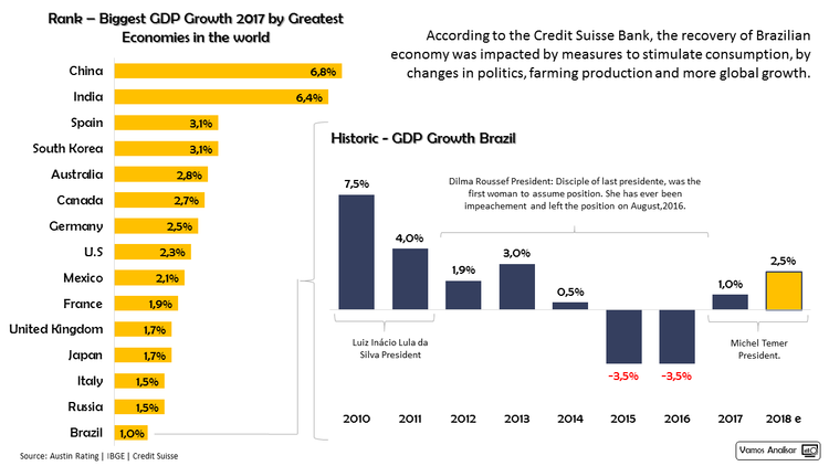
A horizontal bar chart for country rankings orders the data from highest to lowest, which brings the largest group to the top, like a leader board highlighting a clear winner. The GDP growth over time is a vertical bar chart. The bars below the axis show negative growth year to year to depict the downward trend during that time.
When deciding between bar chart orientations, consider the data story you want to tell. It may help you determine if you should run with a horizontal bar chart or jump for a vertical one.
For more details on bar graphs, check out our chart guide. You can also learn more about alignment in graphs by watching this video.