Recently Viewed ›
Recently Downloaded 
Close x
A bar chart (or graph) organises information into a graphic using bars of different lengths. The length of these bars is proportional to the size of the information they represent. For example, here is a vertical bar graph showing the popularity of different colours among a group of children.
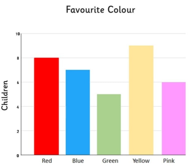
As you can see, the names of the colours are written along the bottom and a sequence of numbers labelled ‘children’ are written along the left hand side. The colours written along the bottom are categories, but may also be referred to as categorical variables. The numbers along the side represent the value of the category, in this case, how many children have said they like each colour.
To read a bar chart, consider the length of the bar connected to each category to find its value. If you wanted to know how many children chose ‘pink’ as their favorite color, you would look at the number that lines up with the bar for ‘pink’ along the vertical axis (in this case 6). If the bar does not line up with a number, but falls in a gap, the value would be the number that falls in between the two numbers given. For example, there are five children who chose green, because the bar aligns with the gap between four and six.
There are a few different ways in which bar charts can be used depending on their purpose. Let’s look at each of these more closely.
The bar chart shown in the previous section is an example of a vertical bar chart. A horizontal bar chart presents information in a similar way, but with the bars going in a horizontal (side to side) direction instead of vertical (up and down).
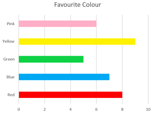
Take a look at this example. The above graph shows exactly the same information as the one we previously looked at; the only difference is that the bars are horizontal. Whether you decide to lay a graph out horizontally or vertically is a stylistic choice, though it may be worth thinking about how much space you have in the document.
Grouped bar charts:
Sometimes, when making a bar chart, you may realise that the information can not only be separated into categories, but into groups within them. In these situations, you could opt for a grouped bar chart. Sticking with the ‘favourite colour’ theme, let’s look at one.
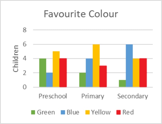
In this example, we are still looking at the popularity of different colours (our categories), but have also grouped them into broad age groups determined by their stage of schooling.
A chart like this might be useful if you wanted to see if age had an influence on the popularity of colours. We would do this by comparing the data and drawing our own conclusions, also known as interpreting the data. When interpreting data, look for patterns and trends and think about what they might mean.
For instance, let’s look at this specific sample group. We could safely say that ‘blue’ is the most popular colour for secondary aged students, as it has the highest value for that age group. If we compared how the colour ‘blue’ has performed between the age groups, we’d also notice that it’s popularity is quite low among preschool kids and average among primary children. From this we could infer that the color blue grows in popularity as children age.
Overall, grouped bar charts allow you to not only compare categories, but the groups within them as well.
Stacked bar charts:
Previously, when we looked at ‘grouped bar charts’, you may have noticed that the bars representing the colours sat neatly next to each other, but were also spaced out between the age groups. The benefit of this is that you can easily see the value of each individual category. The downside is that if you wanted to know exactly how many children participated in each group, you’d have to add them up.
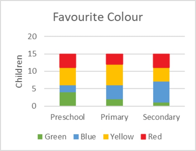
With a stacked bar chart, each bar represents a whole. Looking at this example of a stacked bar chart, we can instantly see that each ‘whole’ (in this case, each sample group of children) has a value of 15. If each of the age groups had a different number of children in it, the length of each bar would change accordingly.
This is useful because a viewer can immediately tell how many children are in each age group. The downside, in comparison to the grouped bar chart, is that we can’t immediately see the exact number of children who have voted for each colour. We can however still see the difference between them, as the categories are colour coded, and tell at a glance which colours seem popular in each group.
These are some simple examples of different types of bar charts, but it’s worth mentioning that there are other possible variations. For example, a clustered stacked bar chart is a mix between the grouped and stacked bar charts.
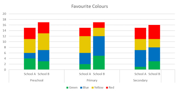
Clustered stacked bar charts allow you to break down the data even further and have multiple stacks per group. In this example, we have done another hypothetical poll at a different school and labelled the two different groups ‘School A’ and ‘School B’. This allows us to not only compare the popular colours by the age groups, but by school as well.
When choosing a type of bar chart, consider your goal. What do you want to communicate with your chart?
Different types of bar charts have different advantages. If you want to show the difference between the individual categories (the colours in the example), you would want to use a horizontal/vertical bar chart, or a grouped bar chart if also separating them into groups. If your aim is to show the total sizes between the groups, a stacked bar chart is the way to go! Want to group the groups together? That’s where clustered stacked bar charts come in handy.
Keep in mind that there are many possible variations of bar charts. For instance, some may not have the numbers along the side, but the figures written on the bars. Some may have more labels than others depending on their purpose. However, as long as you keep these basics in mind - you’ll be drawing and reading bar charts in no time!
If you aren’t familiar with histograms, they look very similar to a bar chart! Because of this, it’s easy to get the two mixed up. They both have an x and y axis and they’re both use bars to display data. So what exactly is the difference?
In short, bar charts organise categorical data, whereas histograms organise numerical data. Remember how we talked about categories (or categorical variables)? Histograms don’t have these. Instead of measuring categories like colour preference, favourite movies or types of pets, they measure things that can be put into numbers. A teacher might use one to see how many students scored well on a test, or a website might use one to compare how well their site has done in a particular year.
Another good way to spot a histogram is by checking to see if there are gaps between the bars as histograms tend to place bars right next to each other. However, this may not always be reliable, as a bar chart doesn't necessarily require gaps between the bars.
Overall, there are many reasons why we use bar charts to organise our data. One reason is that they make it really easy to compare different categories. Looking at some of our earlier examples, you can see right away that yellow is a very popular colour, because it has the highest number of children liking it.
They also make it easier to see trends and patterns in data. If the value of a category is growing, or shrinking, this is called a trend. A pattern is something that seems to keep happening. Laying out the data so you can interpret these patterns and trends is one of the benefits of bar charts.
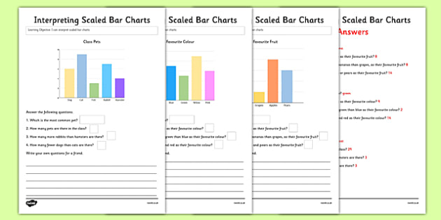
Luckily, twinkl has a great range of teacher-made resources for teaching students about bar charts! This pack includes three bar chart worksheets, which challenge students to interpret data and answer questions about them. It’s a great way to get kids in an analytical mind set and applying what they’ve learned.
Or, if you’re just looking for a nice template, these Bar Graph templates are easy to print and use. It comes complete with a nifty grid to help with drawing bars and calculating values.
 Home
Home  Membership
  TwinklCares
  Create
  Blog
Blog